TUESDAY, JANUARY 15, 2013
We Love Typography, Typography
The website source is: http://welovetypography.com/.
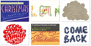
The name of the site is: welovetypography. The overall theme of the site is image based in order to showcase the fontfaces. These include Christmas Greetings, Undress Yourself by Simon Alander, and Shine Bright-Hay-Day Project by Maia. Examples of these font-faces are included in the imagery included above.
The classification for the fonts included in this website are eclectic. The majority of the font-face designs appear to be modern and contemporary. Although, the site does contain slab serif fonts, orginal typesetter designs, and 'throw-backs', these faces appear to contain digital precision incorporated into the design. Lettering by Jose Joaquin Dominguez (John Smith) is illustrative and handwritten in appearance. In contrast, Come Back by Sarah Maxey, utilizes a ribbon pattern. The pattern highlights the transitions of corners. The pattern appears to have folds, or is folded, in order to develop the specific letters of the font-face. Foot Wash is a font that may be implemented in the everyday communication of traffic signs, billboards, or mile markers for example.
The audience is also eclectic. The desktop publisher, office worker, student, wedding planner, or even a business start-up may find the fonts of this site to be useful. The typography arrangement is in tiled text blocks. The font choices are easy-to-see. One issue that may be hard for some users to decern is how to browse the font choices. The arrow button (-/+) is not easily displayed for a user. It is an issue that has to be found by the user. Most (seasoned) website users will find the browse option easily, however this may be something that will turn a novice user away from further exploration in the site.
I like the overall white space that the site utilizes to display the font blocks on every page. The ability to click on an image and gain further information about the particular font-face is optimal. However, not enough information about the particular font is available. I would include more information about the design, year of design, purchase ability, download ability, and examples of possible implementation.
My hope is that I can incorporate one of the beautiful typography choices from this website into a design.


No comments:
Post a Comment