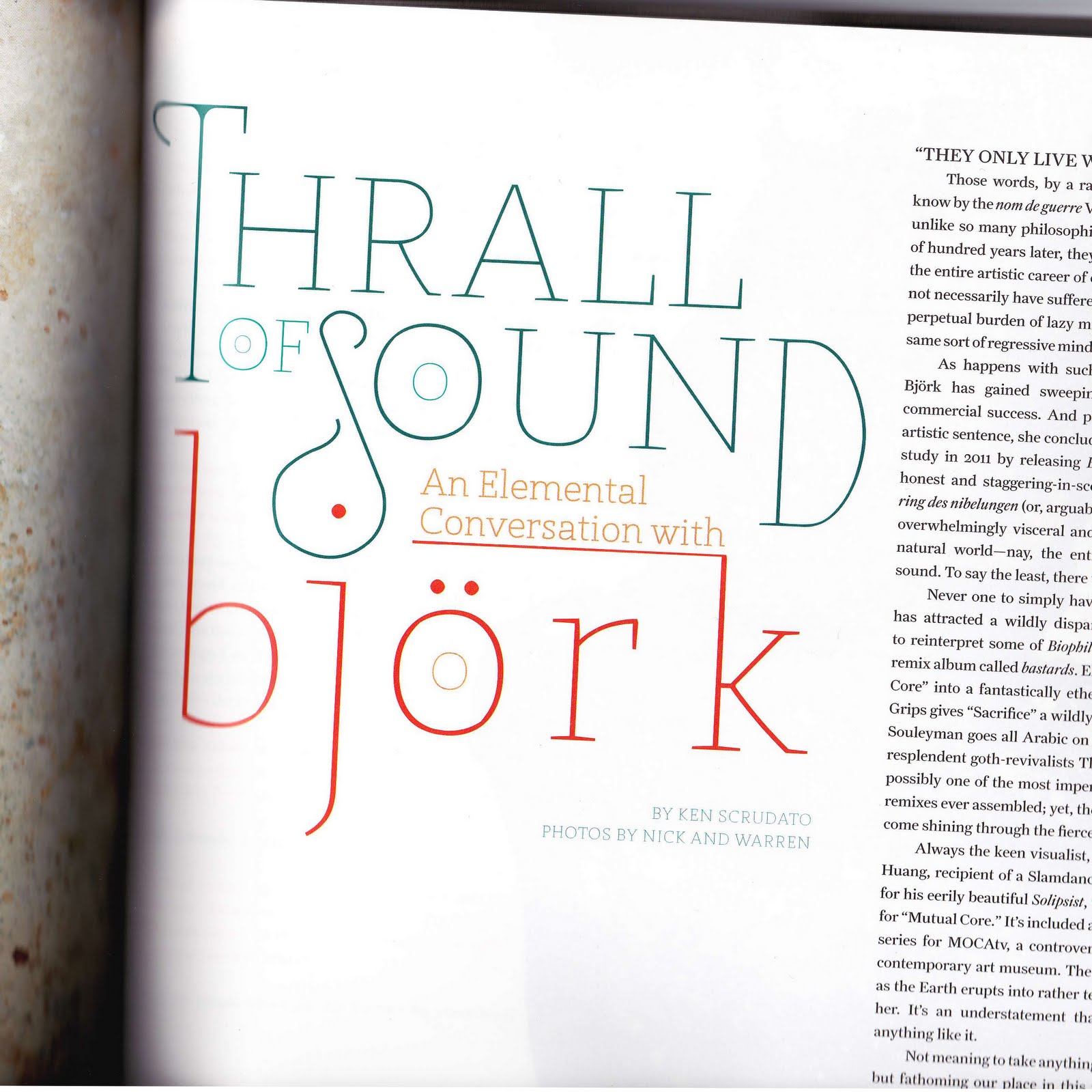
The typeface I chose is used is taken from this interview with musician bjork from Filter magazine. The typeface seems to be some kind of display type, as it wouldn't be practical to use it for anything else. It works well the article because of its grand, sweeping nature. It has a creative flair that goes well with the subject (that being an interview with a famous musician) and just fits well with the creative nature of the magazine in general.
The layout also adds to the dynamic feel that the typeface already established, what with the clever tweaking of size and color, both of which are used to add emphasis to different words. The use of the top of the K as an underline for "An Elemental Conversation With" is also a nice, creative touch.
If I was to use this typeface, or one like it, I think one of the first things I would take from this piece is just the use of layout and the typeface itself as almost an object. The use of color and size is also a good thing to take away from this piece I think.
No comments:
Post a Comment