The front cover of the magazine uses the Modern typeface Didot (H&FJ Didot). Characterized by consistently horizontal stress, flat and unbracketed serifs, and a high contrast between thick and thin strokes. The stroke contrast is exaggerated. This extreme contrast gives Modern typefaces a sophisticated and elegant quality. It's formal and crisp—perfect for headlines!
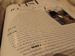
I was drawn particularly to this article, which features 'My List' of the designer's life Roberto Cavalli. First of all, I love the overall composition and layout of the article. The innovative design of the typography being constrained into a circular shape and encompassing the picture on the right hand side is done beautifully. This instantly communicated to me as a unique approach to all the different ways typography can be used. The article itself is Roberto Cavalli telling the reader about his day in 24 hours. I'm not quite sure on this, but I feel like the circular layout used for the type represents almost the shape of a clock. Which if this was the intent, I think it's very clever! If not, oh well, I still am attracted to the layout nonetheless.
The typography used in this article seems to be the Modern typeface Didot for the title and subheadings, and the Transitional typeface Times New Roman for the body text.
Everything about how this article is constructed communicates the message of sophistication, elegance, and fashion. The use of Didot really enhances the formality and makes a bold statement.
I personally really love the look of elegant type, Didot is actually one of my favorite typefaces. The layout of this article really stimulated my thoughts on all the different ways typography can be used to enhance great design. I love seeing all the unique ways typography can be used outside of anyone's comfort zone, and it was a great refresher to see it done really nicely. It will remind me to think outside of the box when it comes to type, and that it doesn't always have to be constrained to a rectangular shape.


No comments:
Post a Comment