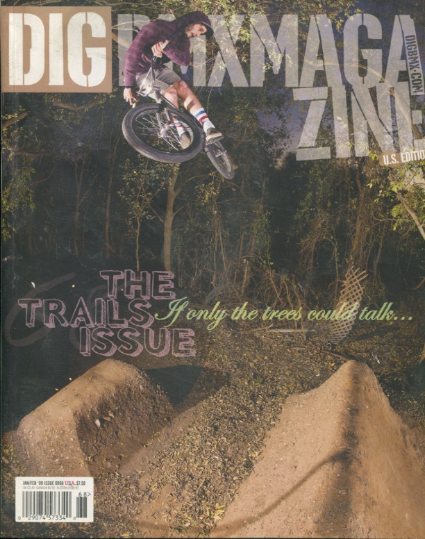
Dig BMX Magazine is more of a DIY magazine. Everything from the articles, to the photos, and to any other content, it is all created by BMXers, for BMXers. With that being said, BMXers are the target audience. I think that this cover is a great example of well used typography. The magazine headline is the same as usual: a stencil typeface, which goes along with the magazine's DIY attitude. I also like how the rider breaks through the type. This magazine is a special issue, that only focuses on "trail" riding, so there aren't many headlines. I feel as if they handled the one headline very well. It is not too obtrusive to the main image, but remains clearly legible and beautiful.
No comments:
Post a Comment