The Art Institute in Chicago has an exhibit called the Thorne Miniature Rooms, which looks exactly like it sounds; a collection of tiny replicas that mimic European interiors from the 13th century until the 1930s, and American interiors from the 17th century until the 1930s. Each one is scaled to where one inch is the equivalent to one foot of the real deal. The miniatures were commissioned by Mrs. James Ward Thorne and were made between 1932 and 1940.

There was no picture showing the typography used for the collection inside the museum, but I liked the cover of the catalogue, just because it was a little unexpected to me.

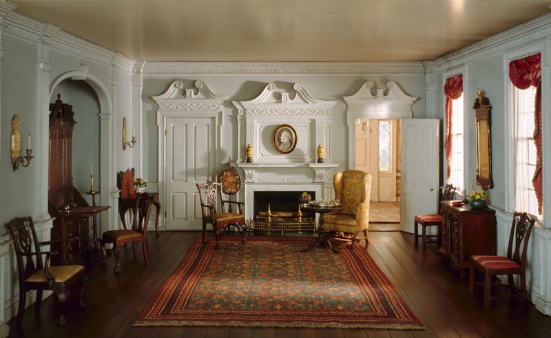
At first glance, it appears to be just a picture of a fancy room, but the enormous size of the title really emphasizes the meaning of the exhibit, and dwarfs the room by comparison. I think the type they used is Garamond, which seems appropriate since it's old, and has a similar time period with the rooms. I like how they went with the opposite of miniature for the type, which works with the cover. However, I think the title is hard to read due to the high contrast in the background, and the giant O in the center is distracting. I feel like it would have been better if they had moved the title down toward the bottom of the picture. What I take away from this is that sometimes going the opposite way of what you initially think is a great solution.
At the Museum of Design Atlanta, they featured an exhibit on skateboard art, and as a result, the design they used was similar to street art. They used a stencil typeface, which works well with the pieces because of it's graphic nature, and they also used red and black, which are colors commonly associated with a punk culture. I liked how they used stripes in different shapes and sticking out at the sides, because to me it creates a look of movement. However, I could go without the paint splatters. That just looks cheesy to me. Something I can take away from this is their use of punctuation. I don't think I have ever seen a design using both a question and an exclamation mark, and I think they pull it off due to the nature of the content. Skaters do seem loud and questioning.

No comments:
Post a Comment