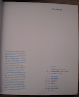
The second catalog I found was called "Introduction, Designs For Making A First Impression". The catalog was showcasing various business cards, with a vast variety of different styles and businesses. The typefaces used were varied, especially in the card designs (for obvious reasons), but mostly switched between two simple serif and sans-serif typefaces. The type layout, like the last catalog, echoed the subject of the series, with the typeface layout here being very professional and easy to read. The layout of the images was also very technical and clean, with most of the examples being laid out in a grid pattern. The choice of the blue background was a nice choice in the example page above, allowing the mostly white cards to pop without distracting from them. This is another case where the big thing I would take away from it would be the layout, but this time of the images as well as the text, since they both do a good job of echoing the catalog's subject matter.
The last catalog I found was called "For The Love Of Vinyl, The Album Art Of Hipgnosis". It was a showcase for, as the title helpfully states, "album art of Hipgnosis", which is (or was) a design company that did allot of classic album covers for classic rock bands such as Black Sabbath and Pink Floyd. The Typefaces used are mostly Sans-Serif for the titles and subtitles and the like, while a Serif was used for the body text. This is another case where the text is made to resemble the typeface used on albums. This connection can be most clearly seen on the table of content's page, with starts of with a "Side One" and then procedes to list the chapters, all of which echoes the song labels on album covers. The table of contents is actually the most interesting part of the design to me, carrying the theme that interested me in the other two catalogs to the extreme.


No comments:
Post a Comment