


My first example is a catalog of hotels around the world that possess unique design in the hotels, whether it has to do with structure or the interior design. The type in the book is a gentle mix of sans-serif and serif font. The use of the serif type, I noticed, is used to accentuate a certain word or sentence, so it's used very lightly. The second picture is the table of contents. It clearly labels the facing pages at the very top of the left page. I like this arrangement of the table of contents. Its a simple grid structure, but it almost looks like a timeline. I also love the use of pictures in the actual table of contents. The rest of the catalog is adorned with large pictures and text placed either on the photo or organized neatly into a corner. I like the use of large pictures, but I don't like having to read all the information in a tiny little corner.
Also love that use of yellow and the establishment of "This is a circle on your page. Please read the text in it for it must be important."

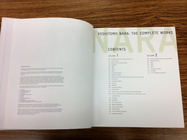


My second is example is an exhibition book of one of my favorite artists, Yoshitomo Nara. I just adored the book once I took it off the shelf. The book cover and binding was made out of a canvas cloth. The type and image on the cover was simply printed out, however left ink residue which actually looks really nice. The type is all sans-serif, and the type in the textbook looked like a relative to the font Courier. The layout in the book is super minimalistic. Especially the grid structure, which is made up of a lot of columns and some spacing between the images. The third picture is the index to where you can find the mediums used for certain paintings. This book really came off like a catalog where I wanted to purchase something.


My last example is Takashi Murakami's exhibition book. Another favorite artist of mine, his art is very surreal and out of the ordinary. In contrast, his exhibition book is made up of a humble grid system. The text is serif and is usually centered in the page, just like his artwork as you can see in picture 2 and 3. This organization was very simple, however when it comes to other artist's work, I think I would like to see more on one page, rather than one piece per two pages. His artwork, though, is very colorful and eccentric and it needs a huge amount of negative space to compensate for it. The text was also quite large in the book. I could understand since the book is rather large, but I would like the text to be several sizes smaller for me to actual enjoy the reading.
No comments:
Post a Comment