


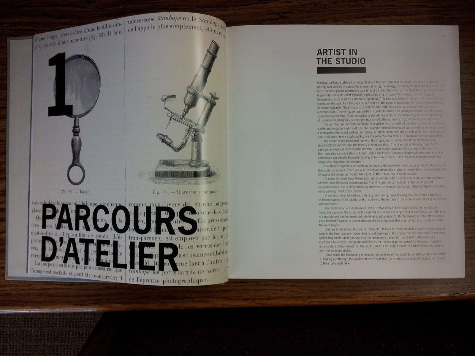
My next catalog is called is a book on William Kentridge, called WK5, and is from the San Francisco Museum of Modern Art. The book is an inch thick, probably about 10x10 inches. In this book, the texture of the cover is a primary feature, where they used a woven fabric type of feel. The title of the book starts on the back cover with a big, black, bold san-serif W, and continues onto the front of the cover with the rest, K, and the 5 as a superscript. I'm not sure why they chose to separate the W from the K5, but the style of using the type on a gray textured background is reminiscent of the artist's work, who worked in black and white, with mediums like charcoal on paper. Again, in this book I enjoyed the table of contents, which featured bold text, capital letters and a sans-serif typeface clustered together at the bottom of the pages. At the beginnings of the chapters, the designer chose to incorporate text with image, similar to the catalog Regarding Beauty, a recurring feature that I like.


What I can take away from this is the minimal design, unconventional contents page, and incorporating type with image. I also thought the textured cover was a nice choice, and such little touches can really show off the book without going overboard.
No comments:
Post a Comment