The first catalog I found is called the Exhibitionist. It's an older catalog examining almost everything about exhibitions. The audience is most likely people who love exhibitions of all kinds. The typeface used looks like Bauer Bodoni. The typography allows me to get the feeling of looking at something that has been around for a long time, yet the photography adds a sense of modernity.

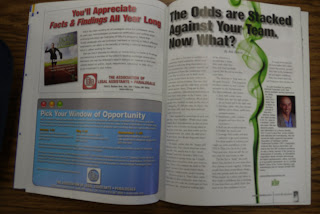
The second catalog I found is called Facts and findings. It's about being successful at work. It gives tips about productivity and other characteristics of a successful worker.
It's a newer catalog and typefaces used are Times New Roman, and Helvetica for the headlines. The audience would be people who are looking for tips about being successful at work.
The third catalog I found is called Fast Company. It's a catalog examining companies, and giving lessons about how to start a company in a successful way. I think most people do not know that much about the process of starting a company. I thought the reading was very interesting. The typesetting is also interesting in the way that some pages were completely covered with type, and no images, while other pages were mostly image based. I was not able to completely identify the typefaces used, but it was mostly bolder San Serif fonts.
These specific examples will probably not influence my own work, but I have realized that some times it is interesting to have pages covered only by type, and also pages covered by images. It makes it more interesting to see the variety on the next page.


No comments:
Post a Comment