http://www.viktoriaklein.de/
Showing posts with label Erin O'Quinn. Show all posts
Thursday, March 21, 2013
Modular Grid / Erin O'Quinn
I'm a big fan of using modular grids for websites, since they are perfect for scanning. Once such example is Viktoria Klein's website, where she incorporates all of her design elements into the modular grid. I also particularly enjoy the grid showing in the background of the website, which emphasizes it's rigid structure. Although all content can be found within the modules, Klein's website has a relaxed feel to it because things simply go in order, and she does not worry about not finishing a row by theme (such as her personal information,) or overflowing into the next line. Information just falls in hierarchical order. This could, however, be perceived as a violation of using the grid since hierarchy does not happen at levels, but I think it works well with her content, and her content flows nicely into one another.
Tuesday, February 26, 2013
Exhibition Designs / Erin O'Quinn
The Art Institute in Chicago has an exhibit called the Thorne Miniature Rooms, which looks exactly like it sounds; a collection of tiny replicas that mimic European interiors from the 13th century until the 1930s, and American interiors from the 17th century until the 1930s. Each one is scaled to where one inch is the equivalent to one foot of the real deal. The miniatures were commissioned by Mrs. James Ward Thorne and were made between 1932 and 1940.
There was no picture showing the typography used for the collection inside the museum, but I liked the cover of the catalogue, just because it was a little unexpected to me.
At first glance, it appears to be just a picture of a fancy room, but the enormous size of the title really emphasizes the meaning of the exhibit, and dwarfs the room by comparison. I think the type they used is Garamond, which seems appropriate since it's old, and has a similar time period with the rooms. I like how they went with the opposite of miniature for the type, which works with the cover. However, I think the title is hard to read due to the high contrast in the background, and the giant O in the center is distracting. I feel like it would have been better if they had moved the title down toward the bottom of the picture. What I take away from this is that sometimes going the opposite way of what you initially think is a great solution.
At the Museum of Design Atlanta, they featured an exhibit on skateboard art, and as a result, the design they used was similar to street art. They used a stencil typeface, which works well with the pieces because of it's graphic nature, and they also used red and black, which are colors commonly associated with a punk culture. I liked how they used stripes in different shapes and sticking out at the sides, because to me it creates a look of movement. However, I could go without the paint splatters. That just looks cheesy to me. Something I can take away from this is their use of punctuation. I don't think I have ever seen a design using both a question and an exclamation mark, and I think they pull it off due to the nature of the content. Skaters do seem loud and questioning.
Tuesday, February 19, 2013
Catalogs / Erin O'Quinn
Regarding Beauty is an exhibition catalog devoted to the dialog regarding the changing nature of beauty over the past four decades of the twentieth century, from the Hirshhorn Museum and Sculpture Garden. The title, typeface, and white background are what drew me to it. It just stood out a little from the rest. The book is an inch thick, about 9x12 inches, and pretty heavyweight, due to the paper they used. The cover features a minimalistic picture of flowers, with an italic, oldstyle, serif typeface. The type is in all caps, with a line directly above and directly below the words, and has the last word of the title in a larger point size, a theme that is seen throughout the book. I thought the overall design was nice, and they used a serifed, effeminate (and a even a little fancy,) typeface throughout, which emphasized the subject matter. I particularly enjoy the table of contents, because it is unconventional and abstract, yet balanced. I also liked how they pulled the titles into the pictures of the opposite page, so that they could keep the same theme and also draw the eye into the picture as well.
My next catalog is called is a book on William Kentridge, called WK5, and is from the San Francisco Museum of Modern Art. The book is an inch thick, probably about 10x10 inches. In this book, the texture of the cover is a primary feature, where they used a woven fabric type of feel. The title of the book starts on the back cover with a big, black, bold san-serif W, and continues onto the front of the cover with the rest, K, and the 5 as a superscript. I'm not sure why they chose to separate the W from the K5, but the style of using the type on a gray textured background is reminiscent of the artist's work, who worked in black and white, with mediums like charcoal on paper. Again, in this book I enjoyed the table of contents, which featured bold text, capital letters and a sans-serif typeface clustered together at the bottom of the pages. At the beginnings of the chapters, the designer chose to incorporate text with image, similar to the catalog Regarding Beauty, a recurring feature that I like.
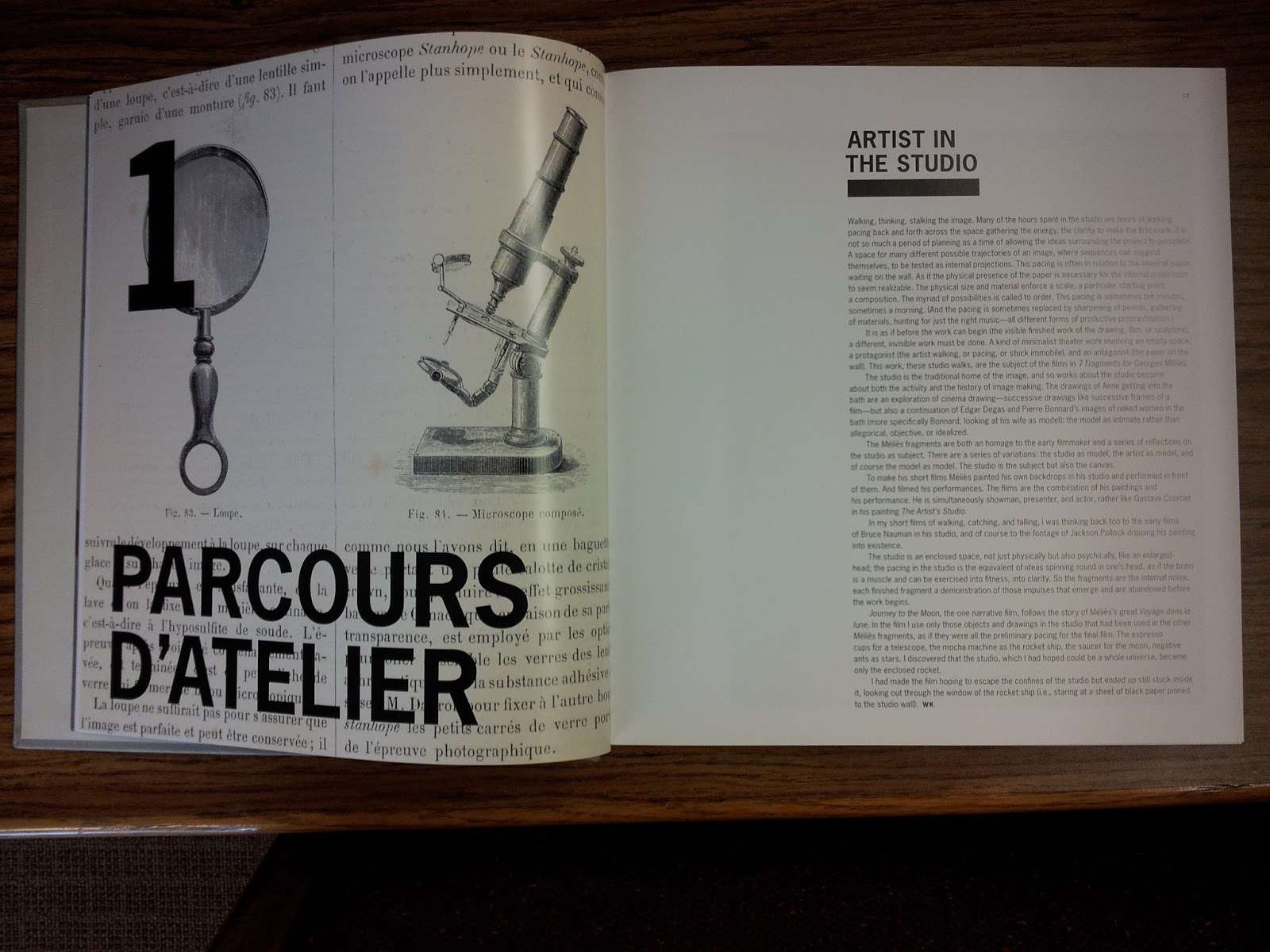
What I can take away from this is the minimal design, unconventional contents page, and incorporating type with image. I also thought the textured cover was a nice choice, and such little touches can really show off the book without going overboard.
Tuesday, February 5, 2013
Daisy / Erin O'Quinn
This is a video called "Daisy" that was made by Mo Ghayour, who took the song "Daisy" by Brand New and animated the lyrics. It looks to be a pet project undertaken by him because all of the photography was done by him as well. I am not sure what typeface it is, but it is sans-serif and in all caps. It looks pretty basic like Helvetica, but it's too narrow for that. So really I have no idea. At any rate, I particularly enjoyed this animation because some of the words he animated were particularly clever to convey the message. For example, when he used the word mouth, he split it in two horizontally, and made new text come in between the word so that it looks like a mouth opening with teeth. He treats many of his words to convey their meaning, such as making the word 'hot' red, and splitting the words mountain and moved into the shape of a peak. The way he fades in and out with the photography gave it a sense of delicacy which contributes to the natural setting. This animation inspires me because I really enjoyed how he added meaning to each of the words, not just making them flip around like some of the other videos I saw. I thought it was a nice job overall.
Monday, January 28, 2013
Nat Geo / Erin O'Quinn
In this special edition of National Geographic, the entire issue is about the best scenic drives around the world. Here's the table of contents.
It follows the same style of design as the cover. It isn't perhaps the most orderly, but I think it is definitely working here. The size and colors determine the visual hierarchy, with the big blue words summarizing the content and also claiming the most attention. The page numbers and the rankings share the next level of hierarchy, and the description comes last. They also draw attention to the important stuff by using the bold version of Gotham, and they saved the descriptions for regular Gotham. They also chose to use negative leading, which works in this instance because there are essentially only four categories, and the point size and bold style is big enough that they can get away with compromising that real estate. Plus the color changes aid in separating the words even with the negative leading.
This table of contents is intended to communicate to audiences of all ages, but it probably particularly focuses on baby boomers who are taking the time to travel now that they are of the retiring age. The large point size aids in that communication. I think this design is a nice break from what I am more used to seeing with smaller, finely sized type and lots of negative space. It is still well designed and I really enjoy the sizes and colors, which is sort of a reminder to me to explore all possibilities instead of reverting back to a very organized, clean and sort of swiss looking design. It is inspiring to me because it's bright and fun, without looking childish.
The magazine itself is a bit smaller than the average magazine, and all of the pages use a glossy, basic magazine type of paper which also exhibit large, beautiful photography.
Tuesday, January 15, 2013
Typography Now: The Next Wave
Unfortunately, I was not able to look at the book in the library, I'll have to save that for February 22 (when it is due back.) However, due to a video I found at webdesignersreviewofbooks.com, I can get a glimpse of that the book has to offer. The cover features a neo-grotesque typeface, but I am not sure which. According to Amazon.com, the book's size is 10.8 x 8.5, so just roughly under the dimensions of your basic sheet of paper.
After viewing the video, the book appears to be mainly images of typographic design that are meant to inspire a designer or other such like minded individual. What I saw of the images captured my interest a great deal more so than the cover. Needless to say, I am not a fan of the cover. Although balanced, it is not easy on the eyes. I don't know if this is because they mashed they type together, or because they used whacky colors, or because it just seems random and awkward, but I do not think that the layout enhances the communicated message, and the typeface choice at this point seems arbitrary. But then again, maybe I am missing something.
What I do like about it, however, is the use of white space along the binding and left side, as well as the typeface choice and the vertical alignment. I do think that some of the images in the book appear to be unconventional and edgy, such as breaking rules like the size and distribution of the type. This is inspiring to me because with something like typography, I struggle to think outside the well established rules, and I would like to experiment more with my designs. I feel like this book would sort of be a healthy break from that norm.
http://www.webdesignersreviewofbooks.com/reviews/typography-now-the-next-wave
After viewing the video, the book appears to be mainly images of typographic design that are meant to inspire a designer or other such like minded individual. What I saw of the images captured my interest a great deal more so than the cover. Needless to say, I am not a fan of the cover. Although balanced, it is not easy on the eyes. I don't know if this is because they mashed they type together, or because they used whacky colors, or because it just seems random and awkward, but I do not think that the layout enhances the communicated message, and the typeface choice at this point seems arbitrary. But then again, maybe I am missing something.
http://www.webdesignersreviewofbooks.com/reviews/typography-now-the-next-wave
Subscribe to:
Comments (Atom)


