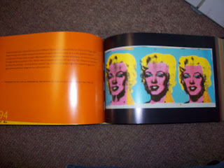
The first exhibition catalog I found was Andy Warhol: 365 Takes. It was all about Andy Warhol's various works, so the title of it is pretty straight forward and allows you to easily know what it's about. It's a pretty thick book and grabbed my attention because of the odd shape. It's longer than it is tall. Upon opening it, you can see his works on one page and commentary or quotes on the facing pages. The images take up most of the page they are displayed on with the rest of the page being black or white, depending on which fits better. The page with the text is frequently a bright color, with black serif font. The font is not to distracting allowing the viewer to appreciate the art first with the information being secondary. Overall a very interesting layout.


The second one I found was called Newspeak: British Art Now. The title might not let you know exactly what the exhibition is about, but it's not so obscure that you wouldn't be able to figure it out. It was for an exhibition of up and coming British artist. I grabbed the book because the spine immediately pulled me in. I really like this one because it didn't allow for text to be distracting. In fact, there was barely any text at all. Most pages only had the name of the artist and the piece that was being displayed. The pages were also different colors. Depending on the piece depicted on the page, the color made sure to enhance it and not draw away from it. This makes an already fascinating book even more intriguing to look at. The only thing that really drove me insane was the fact that the cover of the book had a strike through of the title making it a bit difficult to read.


The final exhibition catalog I found was entitled New York New York. It contains any type of artwork that was created in New York, New York from 1950-present day. Once again, this is full of mostly only images. It does contain some type in it, though very little. It's also san serif and only has the information that is absolutely necessary. The title for the exhibition makes perfect sense, but I'm not a fan of what they choose to exhibit. It's very broad and seems to focus on multiple things.


No comments:
Post a Comment