Thursday, February 28, 2013

Car Museums-Steph Dorazio


   The first car museum is on the East Coast of the U.S. It is in Yorklyn Delaware, close to the Pennsylvania border. It is a picturesque automotive museum named the Auburn Heights Preserve. The museum was once home to the Marshall Family. The collection of cars are from the dawn of automobiles, and run on steam power. It is a smaller museum. The antique cars are dated from 1901-1937. Tours are available, with the mansion and the museum tour (for adults) being about $12.
   The type used for this museum contains script, serif, and "old" appearing fontfaces. Here is what the site states for the exhibition: Permanent Exhibitions-The Marshall Steam Museum features a variety of exhibits highlighting the evolution of 1) Steam technology in America as well as the 2) Marshall family’s legacy.


                                                            http://www.lemaymuseum.org/
Second, is the Le May museum in Tacoma Washington, on the West Coast of the U.S. The logo contains a typeface that (also) contains serifs, however the appearance of the font face is more contemporary, than what is used for Auburn Height's logo. The collection of automobiles are from 1906-1994. It is 165,000 square feet, and 3.5 acres. This museum is more contemporary than the Auburn Heights Preserve. This museum showcases America's 'love' of the driving experience. I like this museum for the aspect that the exhibition catalog would meld well with the aesthetic of the museum.
The museum has events, student tours, community appreciation, concerts, ect. It lists the exhibitions as: Ferrari in America; British Invasion; Indy Cars; and more. The general theme for this museum is cars, cars, and more about cars.


Wednesday, February 27, 2013

Denver Art Museum - Joe Ramirez


The Denver Art Museum caught my eye because of it's shape, being very sharp and modern, yet the exhibition they hold there that I found to be the most interesting was the exhibition they have on American Indian Art. Each of the artworks within the exhibition were created by an individual with their own influences, backgrounds and ideas. The exhibition contains artworks ranging from ancient times to contemporary. They are constantly adding pieces to the exhibit. I really enjoy this exhibit because I've always enjoyed Sociology and seeing how groups and members of certain cultures acted and behaved during certain time periods.

Contemporary Art Museum, Raleigh - Paige Leopold

I found a really cool and interesting museum called Contemporary Art Museum. It is located in Raleigh, North Carolina and it features emerging artists. The museum's collaboration with the North Carolina State University College of Design allows them to keep tabs on local design and new media. The museum features installations in all materials which visitors see and are often allowed to touch as well. They throw huge parties for their openings which include food trucks and live music which sounds pretty rad.


I really like the idea of this place because this is somewhere that artwork of mine would be displayed and I feel like I can relate to this. This museum keeps up with what is presently popular and is very up to date. As they state on their page, "We hope to spark new thinking by creating ever-changing experiences that explore what’s now and nearing."

Each year, CAM Raleigh will host three major exhibitions in the main and street level galleries, and three Emerging Artists Series exhibitions in the lower level Independent Weekly Gallery. The one I took interest in was Alistair McClymont's Everything we are capable of seeing which is show casing from February 1 - April 28, 2013. It contains simple elements that a person sees from time to time but does not pay much attention to. Something as simple as a raindrop perhaps, or the scientific gravity of an object.


"McClymont’s practice incorporates a range of materials and practices that include sculpture, photography and video. His most recent works reproduce natural phenomena as a means of exploring scientific and philosophical ideas. The means of production and installation of the work often reveals the science behind it. At the same time, it acknowledges that there is something inherently unknowable and uncontrollable about the way in which naturally or artificially induced phenomena behave that is capable of inducing awe and wonder."

The Simone Handbag Museum // Taylor Deppisch


I found a really interesting museum in Seoul, South Korea called The Simone Handbag Museum.

The museum is exactly that: it's a showcase of all sorts of handbags dating back to the 1500s. The museum serves to conserve and display these handbags, documenting both history and fashion history. The oldest purses are featured in the upper level, with the newest pieces and trends from the 1900s and after on the ground floor.

The collections are presented chronologically and thematically, which I think was a smart move on their part. It's really interesting to see the transition of the pieces as time progresses. The building itself is representative of what's inside- it's a huge handbag! It's eye catching and memorable, and also somewhat humorous. I think the design decisions they made both architecturally and organizationally throughout the museum were smart ones.

The website is in Korean, SO I was unable to read most of it, and they also had weird settings on their images so here were a few I found from other sources. These purses are found in the museum today.


Sarah Brink- Museum of Broken Relationships

I came across an interesting museum called the Museum of Broken Relationships. It is in Zagreb, Croatia. It probably one of the more interesting museums that I have seen in my life. It is a museum that is based on donated belongings from past broken relationships that did not work out. It shows how people are going through more and more valuable relationship than in the past. The museum also thrives on the fact that we are a consumer society that buys and buys and relationships are part of this buying process. After a break up one might want to get rid of everything they were ever given to rid themselves of the person and to not have to have the reminder. This museum shows how the value and speciality of the object now reverts back to the original mundane object that it once was. The museum displays your donated item along with the story that goes behind it. I really like it because it gives a very intimate moment and object from somebody's life and portrays it to the world. It's interesting to hear the voice behind the person and to see the object's story. If I ever go to Croatia, I would like to stop by!


A quick glimpse at the exhibit:


She was the first woman that I let move in with me. All my friends thought I needed to learn to let people in more. A few months after she moved in, I was offered to travel to the US. She could not come along. At the airport we said goodbye in tears, and she was assuring me she could not survive three weeks without me. I returned after three weeks, and she said: “I fell in love with someone else. I have known her for just 4 days, but I know that she can give me everything that you cannot.”
I was banal and asked about her plans regarding our life together. The next day she still had no answer, so I kicked her out. She immediately went on holiday with her new girlfriend while her furniture stayed with me. Not knowing what to do with my anger, I finally bought this axe at Karstadt to blow off steam and to give her at least a small feeling of loss – which she obviously did not have after our break-up.
In the 14 days of her holiday, every day I axed one piece of her furniture. I kept the remains there, as an expression of my inner condition. The more her room filled with chopped furniture acquiring the look of my soul, the better I felt. Two weeks after she left, she came back for the furniture. It was neatly arranged into small heaps and fragments of wood. She took that trash and left my apartment for good. The axe was promoted to a therapy instrument.

Tuesday, February 26, 2013

The Shape Lab - Lauren McMillan

I stumbled upon this exhibition in MoMA from 2010 called The Shape Lab. I thought it was a really interesting concept that gets looked over a lot. It breaks down art to the bare bone, to what really forms art, shapes, and made them into an exhibit. I think the exhibit title is a perfect representation of the exhibit, and the fact that it is interactive makes it even more of a success. The Shape Lab is an opportunity for people to explore shapes in ways that they never have before. They can break them down, or put them together, making new shapes.  I also think their choice of color scheme was well thought out. They used only black, white, and yellow to keep the simplicity of the exhibit, while still being bold in design. The exhibit is displayed in The Museum of Modern Art in Manhattan, New York. Maybe you've heard of it? It has become the most iconic museum of modern art in the art world, with exhibits showing things from archetecture to photography. It is a definite must see museum if you are interested in modern to contemporary art. This exhibit in particular was held a couple years ago, but i thought it was a great representation of how the title of an exhibit can relate back to the purpose of the exhibit. I was only able to find one photo, but i will post the video explaining the exhibit, so i recommend checking it out.


http://www.moma.org/explore/multimedia/videos/102/596


Link to the video ^

Lauren

Houston Center for Contemporary Crafts- Kristin McCreery


 I choose to do mine about the Houston Center for Contemporary Arts, it is in Houston Texas and show cases more hands on art and 3d sculptures verses paintings. The Houston Center for Contemporary Crafts has some really neat exhibits currently going on, inducing Constructing Solitude, by Janice Jakielski--this exhibit would be loved by children and adults. She plays a lot with your senses in the exhibit and her art work, she makes bonnets, goggles and other types of head wear that impair your sight and hearing giving the wearer a since of solitude. The walls of the exhibit are painted with really lovely stripes that really intensifies the viewers visual senses, that I could only imagine would be really interesting once the head gear was on-- one would think you'd only visually be able to see the bright colors. 


What is also really interesting is that she sets up a station, that again is painted with the same bright green colors for visitors to put on her designs. They is also a small shelf with flowers or some sort to feel while you wear the masks. Jakielski says- “There are not only layers of color, materials, and stitches constructing these fantastical pieces, but the artist also embeds metaphorical layers of meaning within the works. Initially, the pieces seem cheerful and celebratory, but closer contemplation reveals a certain amount of isolation and seriousness.”

Exhibition Designs / Erin O'Quinn


The Art Institute in Chicago has an exhibit called the Thorne Miniature Rooms, which looks exactly like it sounds; a collection of tiny replicas that mimic European interiors from the 13th century until the 1930s, and American interiors from the 17th century until the 1930s. Each one is scaled to where one inch is the equivalent to one foot of the real deal. The miniatures were commissioned by Mrs. James Ward Thorne and were made between 1932 and 1940.


There was no picture showing the typography used for the collection inside the museum, but I liked the cover of the catalogue, just because it was a little unexpected to me. 


At first glance, it appears to be just a picture of a fancy room, but the enormous size of the title really emphasizes the meaning of the exhibit, and dwarfs the room by comparison. I think the type they used is Garamond, which seems appropriate since it's old, and has a similar time period with the rooms. I like how they went with the opposite of miniature for the type, which works with the cover. However, I think the title is hard to read due to the high contrast in the background, and the giant O in the center is distracting. I feel like it would have been better if they had moved the title down toward the bottom of the picture. What I take away from this is that sometimes going the opposite way of what you initially think is a great solution. 

At the Museum of Design Atlanta, they featured an exhibit on skateboard art, and as a result, the design they used was similar to street art. They used a stencil typeface, which works well with the pieces because of it's graphic nature, and they also used red and black, which are colors commonly associated with a punk culture. I liked how they used stripes in different shapes and sticking out at the sides, because to me it creates a look of movement. However, I could go without the paint splatters. That just looks cheesy to me. Something I can take away from this is their use of punctuation. I don't think I have ever seen a design using both a question and an exclamation mark, and I think they pull it off due to the nature of the content. Skaters do seem loud and questioning. 


Roughneck: A Juried ClayHouston Exhibition / Stevie Sharp

Roughneck: A Juried Clayhouston Exhibition hosted by the Houston Center for Contemporary Craft:


This Exhibition is currently running until March 31st in the Artist Hall at the HCCC. This Exhibition features ceramics from the southeast of Texas. There were 107 submissions for this exhibition, only 38 artist made it into the show, so you can really see the talent throughout the exhibition. There is a lot of experimentation and skilled techniques throughout the show. There are a lot of different glaze treatments. There is an Earth/Energy theme throughout the conference and most of the works have a gritty, contemporary feel. This exhibition is to promote and support clay artist and activites. They also want to educate the public on the clay artist. 
   What I can take from this exhibition is that there is a movement within the exhibition. It isn't only showing good work but as a whole the exhibition has a meaning and wants to convey a message. In my own work I would like to apply this method to my "Perfectly Imperfect" exhibition over Dana's Chalk Typography. I want to convey the message that the handmade aesthetic is beautiful, and treasured. That style can evoke memories and ideas of past ideology. For an example: when men actually took women on dates, and opened there doors. When the elderly were respected and when 'yes sir' was a common curtsey. 


Neff_David Bowie Is

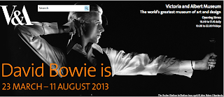
The Victoria and Albert museum in London is known for having a wide variety of exhibitions dealing with design, fashion, high art, and combinations of all of those and more.
They have an upcoming exhibition on David Bowie, titled David Bowie Is, that I think is really interesting. It focuses on his long career as a music innovator and a cultural and fashion icon. The exhibit explores collaborations he's done with artists and designers in every field imaginable from graphics, to theatre, to fashion. The exhibition contains a lot of photography but there are also artifacts, handwritten lyrics, film, original costumes, and much more.


Kirsten Alexander- MoMA Art Lab and Pollen exhibits

I came across an interactive exhibit at the Museum of Modern Art in New York that looks really cool for both kids and adults. In the lab space you can learn about the ways artists represent the human form. You can work with others on an "exquisite corpse" wall drawing, use everyday materials to create a people-inspired project that you can take home when your'e done, make a giant geometric face on a magnetic wall and create a self-portrait with a new digital app by Microsoft.

I think this exhibit is really interesting because it is interactive. You can view art before going into the space and then learn about the art in a hands-on way.


Wolfgang Laib's Pollen from Hazelnut exhibit will be on view until March 11th. Wolfgang created this work especially for the Donald B. and Catherine C. Marron Atrium at the MoMA. The exhibit is a pollen installation and it will be Wolfgang's largest to date (18 x 21 ft). Laib has been collecting the pollen from areas around his home and studio in southern Germany since the mid 1990's. Laib's works are made from one or two natural materials that he collects. He likes using pollen because "pollen is the potential beginning of the life of the plant. It is as simple, as beautiful, and as complex as this. And of course it has so many meanings. I think everybody who lives knows that pollen is important."

I think that this exhibit is unique because it is more than 20 years in the making and it is a 2D installation, when I think of installation I immediately assume that it is 3D.


Wednesday, February 20, 2013

Exhibition: Isabel Castro

The first book I chose was PLEASE LISTEN I HAVE SOMETHING TO TELL YOU ABOUT WHAT IS by Chris Johanson. I liked this book because his friends thought it would be a great idea to put it together and it took a while to find work he did years before that he gave away. He was able to track them down and photograph them properly for this book. He works in acrylics and is very free in his work. He has a huge collection of work including instillation work and sculptures that bring his painted into reality. All the text in the book is in English and Italian.


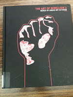
The second book I chose was The Art of Rebellion 2: The world of urban art activism. This book was cool because it showed urban art from around the world that was in public places. I know Europe has a big graffiti problem but it's just the youth speaking out. This book captures rebellion from the smallest of words to huge complicated work that is done overnight and has been planned for months. The text explains the image, situation and location and why it is appropriate for that.


I chose Images Of Death In Mexican Prints because I fell in love with linocut printmaking last semester. I love the work of Jose Gaudalupe Posada and Manuel Manilla so this book was perfect. It focuses on death. Whether its is brought on by revolution, old age or sickness. This book is something I'll purchase for my personal library. The pages have a black border around it that gives the work a lovely frame. The book text is in English and Spanish.


Judith Villarreal--Catalogs

The first book I decided to choose was Data Flow, written by Gilles Berton, the book covers data visualization which is something I am very interested in.  The book is design beautiful, extensive use of extremely graphic material made from technological medium.


The next book I was interested in was Contemporary Art in Print by Jeremy Lewison. The color scheme and the large sans-serif fonts really made the book look visually intriguing. The title is pretty self explanatory and the book itself is definitely made for the art lover in a designers way.


The third and last book features design used for fabric prints and patterns called Twentieth Century Pattern Design, beautiful book about designing for fabrics.