

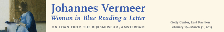
The first exhibition I chose to include is for the Dutch painter Johanne Vermeer's 'Woman in Blue Reading Letter'. The painting is from the the mid 17th century, and is one of Vermeer's most famous of all time. The logo here is similar in dimension to the 2'x6' and features a crop of the portrait on the left side. The text for the header is similar to a Joanna, and transitional serif face. It is a deep blue on a very light peach color, quite appropriate for the color palette used by Vermeer. The subheader is the same face just italicized, and the second smaller type is a sans-serif, possible Trade Gothic.

The second exhibition I am writing about is for another Dutch painter, from an earlier time. Maerten van Heemskreck's 'Ecce Homo' was triptych painted in the 16th century. The poster is composed like a portrait more than a landscape. The type used for the title is a Grotesque sans-serif and is all caps. The color of the type itself is a great match for the crimson that it sits on. I would guess that maybe it is Trade Gothic or Frutiger.
No comments:
Post a Comment