Tuesday, January 29, 2013
Nike Lebron 9 Poster - Michael Johnson
My type specimen came from the most recent Communication Arts that actually focused on typography. I chose a Nike ad that used a sans-serif typeface called Solano Gothic. These posters were used to promote the LeBron 9 shoe with each poster illustrating a different performance benefit of said shoe. My favorite was the Versatility poster which really moved the viewers eye across the page with the unique type layout. Both of the posters type mimics the image behind it and the definition of the word, with elevate getting bigger as you move up the poster and versatility moving across the poster in different orientations. This will influence my work, because often in typesetting one forgets about the actual word that is being set, and this poster reenforces what the word means through its layout.
Juxtapoz (Julio Barrientos)
In one article where they interview artist David Stoupakis, they chose a decorative typeface that emulates the title of the article. "Ribbons and Lace" like the title the typeface has swirls coming off some of the serifs that give it that effect of a ribbon.
In another article they chose an Old English style typeface for quotes throughout the article. The typeface here again emulates the personality of artist and his work to give off a graffiti or tattoo feeling.
Seeing type used like this throughout a magazine is pretty neat. I can see myself doing the same thing to give a spread a bit more personality other than just through the use of color and images. It also makes the spread more interesting highlighting things that you would want to pop out from the surrounding text.
Sphere Magazine - Ben Schmidt
Can definitely say this isn't my most favorite magazine, but the use of type is done really well. Sphere magazine focuses on high end beauty, fashion, and art. So the use of type reflects this. It does this by using a think sans serif (probably helvetica if I had to guess). The thin type gives the high end audience a sense of luxury and refinement.
The type is laid out so there is plenty of breathing room and allows the viewer to immediately read the type but not be distracted by it so that they can focus their attention on the image.
As far as inspiration goes, I absolutely love the "Contents" page set up. It is a clever way to use type and image together especially for something like a table of contents.
Monday, January 28, 2013
National Geographic - Amy Millett
National Geographic, as I'm sure most people know, is a monthly photojournalistic magazine that focuses primarily on themes such as travel, animals, and the environment. I chose this issue specifically because the cover and the articles inside have countless instances of beautiful integration of text and imagery.
If you consider the cover picture above, you will notice that there are three different typefaces at work: a serif that closely resembles Times New Roman, a more condensed sans serif, and an italic serif. Each typeface is drastically different, but the use of sized-based hierarchy and color helps to differentiate each line of text. The type also works together with the fox photo, playing off the color palette and idea of dimensional space. You will notice that some of the type is in front of the fox, while the more easily recognized logo type is in the background. Neither the text nor the photo is standing alone, the two elements work together to create a cohesive whole.
National Geographic continues to pay special attention to the way that type and image work together in it's articles, as you can see here.
Since National Geographic is widely known for it's fantastic photos, it would seem easy to place typography on the page as an afterthought or a secondary concern. This isn't the case; clear attention has been given to both aspects of design. I really like the way that they lay out their pages (even those that are text heavy) because the designs are simple, yet integrated. Type never looks like it is out of place or just floating around in random space. It's a good reminder of the impact that typography can have on the way we view and interpret information. It also helps to prove that typography is just as important as pictures.
Nat Geo / Erin O'Quinn
In this special edition of National Geographic, the entire issue is about the best scenic drives around the world. Here's the table of contents.
It follows the same style of design as the cover. It isn't perhaps the most orderly, but I think it is definitely working here. The size and colors determine the visual hierarchy, with the big blue words summarizing the content and also claiming the most attention. The page numbers and the rankings share the next level of hierarchy, and the description comes last. They also draw attention to the important stuff by using the bold version of Gotham, and they saved the descriptions for regular Gotham. They also chose to use negative leading, which works in this instance because there are essentially only four categories, and the point size and bold style is big enough that they can get away with compromising that real estate. Plus the color changes aid in separating the words even with the negative leading.
This table of contents is intended to communicate to audiences of all ages, but it probably particularly focuses on baby boomers who are taking the time to travel now that they are of the retiring age. The large point size aids in that communication. I think this design is a nice break from what I am more used to seeing with smaller, finely sized type and lots of negative space. It is still well designed and I really enjoy the sizes and colors, which is sort of a reminder to me to explore all possibilities instead of reverting back to a very organized, clean and sort of swiss looking design. It is inspiring to me because it's bright and fun, without looking childish.
The magazine itself is a bit smaller than the average magazine, and all of the pages use a glossy, basic magazine type of paper which also exhibit large, beautiful photography.
Harper's Bazaar - Lindsey Laibinis
I chose to do February's issue of Harper's Bazaar. It's an American women's fashion magazine first published in 1867. Sophisticated and provocative, it's a must-buy fashion resource for women. The reader is treated to beautiful trend-setting fashion, beauty tips, and popular culture. In every issue it features the usual sections such as horoscopes, fabulous at every age, where to buy, etc.
The front cover of the magazine uses the Modern typeface Didot (H&FJ Didot). Characterized by consistently horizontal stress, flat and unbracketed serifs, and a high contrast between thick and thin strokes. The stroke contrast is exaggerated. This extreme contrast gives Modern typefaces a sophisticated and elegant quality. It's formal and crisp—perfect for headlines!
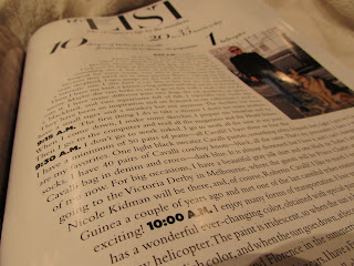
I was drawn particularly to this article, which features 'My List' of the designer's life Roberto Cavalli. First of all, I love the overall composition and layout of the article. The innovative design of the typography being constrained into a circular shape and encompassing the picture on the right hand side is done beautifully. This instantly communicated to me as a unique approach to all the different ways typography can be used. The article itself is Roberto Cavalli telling the reader about his day in 24 hours. I'm not quite sure on this, but I feel like the circular layout used for the type represents almost the shape of a clock. Which if this was the intent, I think it's very clever! If not, oh well, I still am attracted to the layout nonetheless.
The typography used in this article seems to be the Modern typeface Didot for the title and subheadings, and the Transitional typeface Times New Roman for the body text.
Everything about how this article is constructed communicates the message of sophistication, elegance, and fashion. The use of Didot really enhances the formality and makes a bold statement.
I personally really love the look of elegant type, Didot is actually one of my favorite typefaces. The layout of this article really stimulated my thoughts on all the different ways typography can be used to enhance great design. I love seeing all the unique ways typography can be used outside of anyone's comfort zone, and it was a great refresher to see it done really nicely. It will remind me to think outside of the box when it comes to type, and that it doesn't always have to be constrained to a rectangular shape.
Runner's World
I am interested in this article not only because it's about running, but also because I like how the alignment of the text works well even though it is flushed left, flushed right, and also centered. Usually I find it hard to place the text with different alignments on a page and make it look good.
However, I think it has been made successfully here because of the placement of the runner, and how it looks like the text is surrounding the runner . But there are still some minor issues. I would make it look a little more symmetrical if I designed it, and I would have added some more open space and not make the text look so squeezed together.
HOW Magazine, Kirsten Alexander
HOW magazine is a design magazine that showcases the work of the winners of their design competitions. The magazine also covers news and tips and sometimes introduces new typefaces.
I chose this spread because not only is the spread itself clean and organized, the pieces have great type. There is just the right amount of negative space and the arrangement of the captions are inspired by the National Typographic style. There is appropriate hierarchy and the page is easy to navigate.
The headline and titles are set in Parisine Plus and the body copy is in Fairfield.
I chose this spread because not only is the spread itself clean and organized, the pieces have great type. There is just the right amount of negative space and the arrangement of the captions are inspired by the National Typographic style. There is appropriate hierarchy and the page is easy to navigate.The headline and titles are set in Parisine Plus and the body copy is in Fairfield.
Wired Magazine - Pedro Villegas
Wired magazine is about different topics, and in each
article of this magazine there is always a different style with different
typefaces. It is a really good magazine
to find a variety of typefaces. Wired magazine combines san serif and serif typefaces
in its title and also in each article to
create a sense of balance. The slab Serif typeface, similar to Courier font, used in the table of contents of this issue
connects with the content and transmits the message. I like how the typography
plays a vital role in communicating ideas. During the 19th and 20th century, people used typewriters to write
letters and other kind of documents. In
this Wired Magazine the table of contents reflects the idea of an old document
because it talks about crime, organized Mafia, scammers, and during that time detectives and criminal investigators used
typewriters. The layout resembles old books or manuscripts, especially because
of the letters at the beginning of each
paragraph called initials. It looks like an old document but with a modern
style because of the san serif typefaces. I like the visual cue that exists
between the headings and the text. Typographic contrast such as sans-serif/serif
combinations and lower and upper case letters add dynamism to the content. I think this kind of
compositions and layouts will help me to understand better what kind of
typefaces should I use and at the same time what kind of visual cues are better
to emphasize the content of the text.
HOW Magazine, Collin Hall
HOW magazine essentially covers the latest news, tips, and upcoming events for the design community. Alongside its regular articles over the design business, creativity and inspiration, upcoming technology, and book reviews, HOW also hosts design competitions and features the winning work in the next issue.
In the spread below, HOW showcases two of the winners of their InHOWse-Design Awards. Each project needed to have an explanation, multiple photographs of the work, descriptions for each piece, and an extended caption listing the company/creative team involved. The designers at HOW took a large amount of information, established a grid, left some negative space, and set a solid hierarchy--turning a potentially cluttered and complicated spread into something easily navigated and visually appealing.
On the single page below HOW begins an new article with plenty of negative space, a clear hierarchy, and a flexible grid. The generous use of negative space and colored type provide an obvious break in the text, signifying a new article's beginning. The type is laid out in two justified columns within the page's grid, similar to the following pages of the article for consistency.
HOW magazine's body text is set in the serif Fairfield, designed by Rudolph Ruzicka. The display face is set in the sans-serif Parisine, originally designed by Jean Francois Porchez.
Communication Arts - Holli Hollingsworth
Communication Arts magazine is the largest design magazine in the world and shows the best work in graphic design, advertising, illustration, photography, interactive design and typography. I chose a typeface from it that was used for one of the posters in Jack Daniel's "Independence Day" poster campaign. They used a condensed slab serif typeface for the words "freedom" and "is a choice". I don't know the exact name of the typeface but I think it most closely resembles Rockwell. The poster features an statement based on the theme of independence. It was handcrafted and the type is made to look like it was embroidered to add to the theme of being handmade and carefully crafted just like Jack Daniels is. I think that the slab serif was a good choice because it looks handdrawn and is a bold brick like typeface that emphasizes the message.
Nathan Hostick: Dig BMX Magazine
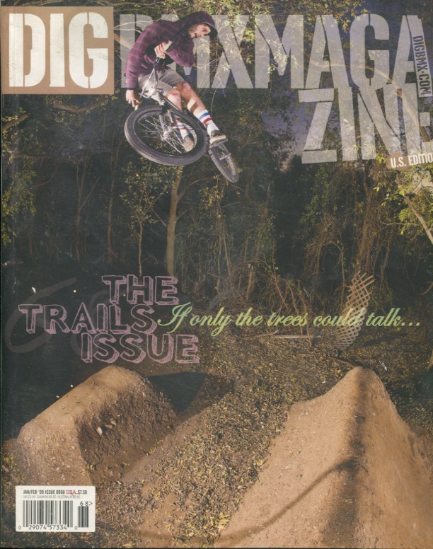
Dig BMX Magazine is more of a DIY magazine. Everything from the articles, to the photos, and to any other content, it is all created by BMXers, for BMXers. With that being said, BMXers are the target audience. I think that this cover is a great example of well used typography. The magazine headline is the same as usual: a stencil typeface, which goes along with the magazine's DIY attitude. I also like how the rider breaks through the type. This magazine is a special issue, that only focuses on "trail" riding, so there aren't many headlines. I feel as if they handled the one headline very well. It is not too obtrusive to the main image, but remains clearly legible and beautiful.
Harper's Bazaar- Shelby Stockman
Harper's Bazaar uses the font H&FJ Didot, a modern serif typeface. This Typeface was designed in 1991 for Harper's Bazaar's redesign by Hoefler & Frere-Jones. The serifs are extremely thin and the strokes have an incredible amount of contrast.
Often for the beginning of an article a large single character that goes with the article name. In the examples below the f for fashion is larger than the page. The curve of the f mimics the slant of the woman in the picture. Also the O for the Oprah article is large because of the stardom Oprah has achieved. I think these are beautiful design elements and the elegance of Didot adds to the elite tone of the magazine.
The type in this magazine has continued to influence the style of my designs. I love the look of modern typefaces and the up scale feel they give. Harper's Bazaar is the magazine I turn to first when I need inspiration.
Justin Halley_Filter
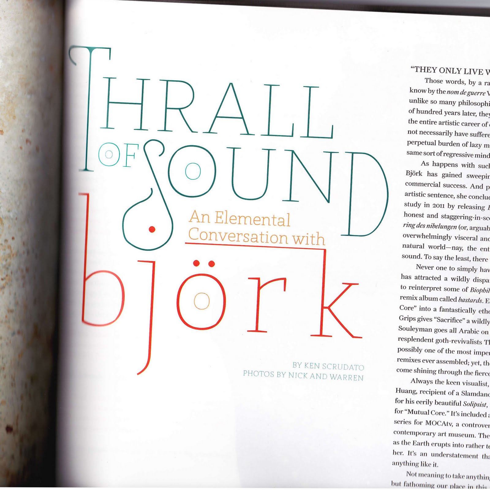
The typeface I chose is used is taken from this interview with musician bjork from Filter magazine. The typeface seems to be some kind of display type, as it wouldn't be practical to use it for anything else. It works well the article because of its grand, sweeping nature. It has a creative flair that goes well with the subject (that being an interview with a famous musician) and just fits well with the creative nature of the magazine in general.
The layout also adds to the dynamic feel that the typeface already established, what with the clever tweaking of size and color, both of which are used to add emphasis to different words. The use of the top of the K as an underline for "An Elemental Conversation With" is also a nice, creative touch.
If I was to use this typeface, or one like it, I think one of the first things I would take from this piece is just the use of layout and the typeface itself as almost an object. The use of color and size is also a good thing to take away from this piece I think.
Single Word, Big Adventure
This is the work of Kendrick Kidd and was done for a short-lived skateboard company called, as the image suggest, Valhalla Skateboards. As a general rule this font really couldn't be used for anything more than a logo or short catch-phrase, due to its intricate nature and unstable consistency (Differing versions of the same letters: three forms of "A" and two forms of "L"). This being said, I really enjoy what he has done here. Type was invented for a few simple reasons: to store and organize facts and data such as the business transactions of some ancient camel salesman, to describe where or what may be found (how exactly would we get to said salesman's tent in order to purchase said camels without the aid of visual signs or a map?), and lastly to remember and spread ideas and stories, as was done with The Illiad and The Odyssey. If words are used to relay stories, why not have them become part of the story itself? While looking at this type treatment that is exactly what happens. The way the viewer's eye gets to go along from letter to letter is in its own way some small adventure that, if stretched by the imagination and a bit of artsy elaboration, relates to the grand tales and adventures of the Norse Gods this logo harkens to.
Game Informer - Kevin Snyder
Game Informer is a US-based monthly video game magazine. They have been around since the 1990s, but just recently redesigned their magazine (and website) in November 2009. This issue is post-redesign. I personally really liked the changes they made, especially to the type face on the front cover. I do not know what the type face is, but I like that it is very modern and angular. It fits the video game and electronics theme much better than I thought their previous type face choice did (which I don't have a scan of).
This particular issue caught my attention even more, and not just because of the gorgeous artwork. Typically the font will be a single color, associated with whatever game is their cover story for that month. But for this issue, they really incorporated the text into the rest of the artwork on the cover. It is still angular and video-gamey, but colored to match the sketchy style of the rest of the cover. I'm not sure I like the paint splotch to dot the letter I though.
I'm not too sure how this will help me, but I really enjoyed how the magazine cover incorporated the type, with the non-type, so that it was successfully unified. But I think that is something important to know: how to make the type not feel out of place when designing with more than just type.
This particular issue caught my attention even more, and not just because of the gorgeous artwork. Typically the font will be a single color, associated with whatever game is their cover story for that month. But for this issue, they really incorporated the text into the rest of the artwork on the cover. It is still angular and video-gamey, but colored to match the sketchy style of the rest of the cover. I'm not sure I like the paint splotch to dot the letter I though.
I'm not too sure how this will help me, but I really enjoyed how the magazine cover incorporated the type, with the non-type, so that it was successfully unified. But I think that is something important to know: how to make the type not feel out of place when designing with more than just type.
Communication Arts - Austin Stewart
As I was sifting through the latest Communication Arts, this ad stuck with me. It was extremely awkward looking, with the dolphin tattoo across the man's temple. What decision process did this man go through to end up with a dolphin tattoo'd to his face?
But for this ad to work, the image and the text had to be connected. This was achieved effectively by the use of swooping calligraphic letters in "Can be Scary," and the pointed needle like letter in the futura font of "COMMITMENT." The use of the type in these instances helps me to further understand situations where type can assist the meaning, and help make connections with images you use.
I feel this ad spoke to me because I share the same fear as the copy. I don't want to get a tattoo because I'm not ready for that commitment. Just like moving in with a girl, it's a big relationship to get yourself into. So this ad is targeting people who are looking for stock images, but don't want to risk getting the wrong one. The add attempts to alleviate the fear, by showing their understanding of the audience.
But for this ad to work, the image and the text had to be connected. This was achieved effectively by the use of swooping calligraphic letters in "Can be Scary," and the pointed needle like letter in the futura font of "COMMITMENT." The use of the type in these instances helps me to further understand situations where type can assist the meaning, and help make connections with images you use.
Bicycling Magazine - Villegas, Mitch
Well in this add for Wilier inside Bicycling magazine, I chose to focus on the font used for the attention grabbing phrase "OWN THE BIKE, OWN THE MOUNTAIN." The font used looks like it's bold, perhaps a grotesque or sans serif type font but as I've said before, I've forgotten a lot of terminology. The font was obviously meant to capture the reader's attention and in this case the audience they are trying to reach is a cyclist who feels they need absolute control and command of not only their bike but the terrain they ride on. I think the font choice works well with the message the ad is sending. To convey the message of owning your bike, as well as a mountain, both commanding statements, you need a font that carries that feel and I think they chose a fitting font with a color that helps add to the message. I think what I can take away from and add to my own work is to really be aware of the attitude of the message and not just look at what is actually written.
Food Magazine - Emmanuel Ramirez
Food Network Magazine has a lot of reading material and content divided up by recipes, articles, and a large number of side comments.
To arrange all this information in a hierarchy, Food Network Magazine uses Arial as the main font in different sizes, colors, and styles. Typically a bold version of Arial will list ingredients and small titles of captions, while the color red is used for recipe titles and nutritional facts.The font Georgia serves a different purpose in the magazine for articles and quotes. The serif gives a more personal appeal to the type, making it appropriate for when Bobby Flay is talking about his secret ingredients for a guacamole.
The type is arranged in various columns and grids as well as various different fonts that are used exclusively for one page or purpose. As an example, handwritten script is thrown throughout the magazine to replicate someone taking notes on the paper. I agree with the hierarchy of the typefaces, as I would use them in the same manner to arrange information. Arial gives a cleaner, readable look to something while giving an informative appeal, while Georgia gives a narrative feeling as if someone's voice is actually reading the text.
W Magazine
W magazine is a great magazine with wonderful layouts and fantastic photography. This thick tabloid magazine with its rich pages uses lots of serif fonts on the front page. After a little bit of research I discovered that the font used for the logo is Benton Modern. Within the magazine, fonts such as Grafik and Grotesk are also used. Lots of serif fonts, and slick slender type for headlines makes for a sophisticated look. The layout is open and airy. I love the grids used in the magazine.
Subscribe to:
Posts (Atom)