Wednesday, February 20, 2013

Austin Stewart // Catalogs


The first book I sifted through was Pierre Mendell's collection of designs. The book was titled very simply Pierre Mendell. As simple as the title is, the catalog followed suit. 

The entire book has very little text, and is comprised of large images of Mendell's designs. This made it easy to look through quickly, but when I wanted more info about what the logo was for, I had to search at the back of the book in the appendix for the information.

Pierre Mendell was a graphic designer through the mid 20th century, and is known for his simplistic images. He believed that the fastest way to communicate your message was to make it as simple as possible. Through the catalog of his work, the theme of simplicity is very pronounced, and everything is communicated effectively until you run out of information.

The size of this book was close to 12 inches wide by 8 inches tall.


The second book I read was about artistic culture within London's royal districts.  The book was aptly titled Artistic Circles.

Most of the book was text based to explain how the artists lived in the early 20th century. The book had several early photographs of the rooms where they painted, and blueprints they had made for the rooms they had built. The author explains why they built the rooms they way they did, how they funded their lives, and how they lived their lives. Which, as it turns out, is pretty much like a college dorm life. 

The photographs and paintings of the room show the illustrious lives the artists attempted to live, and does an excellent job of explaining everything.

The book is about 10 inches tall by 7 inches wide.


The final book I read was for the graphic designer, Max Huber. The book was titled Phaidon.

The book was laid out into sections. The author would explain Huber's style, his process of creation, and then show the pieces that he created. The sections were divided up into different eras of work, from advertising, design, music, photography, film, and logos. The images had accompanying descriptions of the time period and why the design work was created by Huber.

Max Huber was a Swiss graphic designer and a master of typography. He was influential in the world of typography and thorough enjoyed music, specifically jazz.

The book size was about 10 inches wide by 12 inches tall.


Catalogs--James


 My first selection was a book on Contemporary Art in Print, which is rather uninterestingly displayed on the cover. It's interesting that a book that would end up being so chalk-full of vibrant colors and prints would be presented so plainly. The inside of the book had very little space dedicated to text, focusing more on the images that it showcased. What text there was strayed very little from the standard labeling of art, I really liked this approach of keeping the viewer's eyes on what they picked up the book for.


 Second in the list was an incredible book that centered around artwork that, though a collection, was no where near a gallery (unless it was outside of one in protest or something of the sort.) The pictures in this book reflected the same level of attention paid to the images in my first selection, but there was a bit more type due to the necessary "need-to-know" nature of the pictures. Without the philosophies to back up the images some of their strength and boldness may be lost on the viewer.


The final book was a nice ending selection by presenting much more text than the first and therefore  making The Art of Rebellion 2 a cozy moderate point between the two. Some pages contained nothing but text, while others were split half and half as an interview took place between author and artist. In the middle of the book there was a 20-or-so page spread dedicated to nothing but full page prints of Chuck Close's work. Of the three layouts I feel like this one will be most useful in creating a catalog of my own for a typography class because of the interesting uses and layouts of type.

Villegas-Catalogs


In Gauguin and Van Gogh L'avventura delcolore nuovo, a twelve by ten inch catalog, the table of contents had an interesting layout. Alternating the the side that the text and pictures were set as the table moved down the page broken by simple lines to seperate chapters. The font in the book was a transitional or modern serif and worked well to create a clean look. In the catalog Forever Picasso the layout of the pages were very nice. The text, a modern type serif I'd guess, was oriented toward the outer edges of the pages on the lowere half of each sheet, except for the third page after every new chapter when the text would be set closer into the spine which I thought was a nice anomaly. The placement of the type left a clean negative space in the center of the book where small notes of the pictures set in the top half of the pages.  I really enjoyed this layout and would love to emulate that style in my own catalog. And in the table of contents for Durer was very organized and I liked the use of Roman numerals for the chapters and regular numerals to indicate each section of the chapter. The organization and variety of type face and sizes is something I'd look to in my own catalog.

Catalogs - Ramirez


The three exhibition catalogs that I picked up at Alkek Library are Klimt’s Women, Oskar Kokoschka, and Alfredo Häberli: Design Live. 


Klimt’s Women features a rich, detailed background over Gustav Klimt’s relationships, specifically those that lead to a female portraiture.  The book is densely packed with text, supported by color photographs of his paintings as well as miniature grayscale photos that supplement the reading.

The typeface for the main bodies of text is a san-serif font resembling Trade Gothic. Titles of chapters or sections use a serif font, and an attractive thin san-serif at the beginning of chapters for the name Gustav Klimt.

Oskar Kokoschka features paintings by the Austrian artist, each having its own caption with details and history. The type is laid out in square grids of information with numbered paragraphs assigned to each painting that lies in a different page.
The main body type is a serif font resembling Georgia. 

Alfredo Häberli: Design Live is the brightest catalog, most filled with photography and supplemented with essays written in German. The photos are different genres, ranging from still lives to industrial design portraiture.  The serif type is presented in a very large, easy to read manner. 

Lily Kowalski - Catalogs


My first example is a catalog of hotels around the world that possess unique design in the hotels, whether it has to do with structure or the interior design. The type in the book is a gentle mix of sans-serif and serif font. The use of the serif type, I noticed, is used to accentuate a certain word or sentence, so it's used very lightly. The second picture is the table of contents. It clearly labels the facing pages at the very top of the left page. I like this arrangement of the table of contents. Its a simple grid structure, but it almost looks like a timeline. I also love the use of pictures in the actual table of contents. The rest of the catalog is adorned with large pictures and text placed either on the photo or organized neatly into a corner. I like the use of large pictures, but I don't like having to read all the information in a tiny little corner.
Also love that use of yellow and the establishment of "This is a circle on your page. Please read the text in it for it must be important."


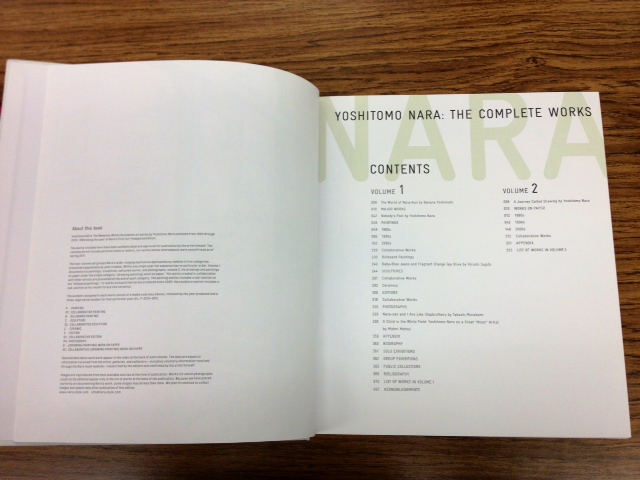
My second is example is an exhibition book of one of my favorite artists, Yoshitomo Nara. I just adored the book once I took it off the shelf. The book cover and binding was made out of a canvas cloth. The type and image on the cover was simply printed out, however left ink residue which actually looks really nice. The type is all sans-serif, and the type in the textbook looked like a relative to the font Courier. The layout in the book is super minimalistic. Especially the grid structure, which is made up of a lot of columns and some spacing between the images. The third picture is the index to where you can find the mediums used for certain paintings. This book really came off like a catalog where I wanted to purchase something. 


My last example is Takashi Murakami's exhibition book. Another favorite artist of mine, his art is very surreal and out of the ordinary. In contrast, his exhibition book is made up of a humble grid system. The text is serif and is usually centered in the page, just like his artwork as you can see in picture 2 and 3. This organization was very simple, however when it comes to other artist's work, I think I would like to see more on one page, rather than one piece per two pages. His artwork, though, is very colorful and eccentric and it needs a huge amount of negative space to compensate for it. The text was also quite large in the book. I could understand since the book is rather large, but I would like the text to be several sizes smaller for me to actual enjoy the reading.

Tuesday, February 19, 2013

Trey Beahm-Exhibition_Catalogues

With such a vast amount of catalogues to choose from, I found it hard to land on just a couple, but the first exhibiton catalogue that I chose was titled, "Constellation," showcasing Ingrid Calame. This book honestly stuck out to me for how overly abstract it was compared to all those around it. It is only about a foot tall, and maybe ten inches wide, but yet it bares no front title or any words at all other than just a name on the spine, but instead it just what seems to be a splatter of paint all around. As I began flipping through the first few pages, I continued to only see more abstract line and color images, until eventually a title page was reached. Then I began to learn who Ingrid Calame was, because all the proceeding images and works of art displayed, started to have words next to them discribing who she was and how these works of art came to be. This catalogue showed her work for what it was, being very large pieces which either found themselves in galleries or in a lot of cases, out in ambient environments. She frames her work, or Constellations, around what lies beneath them, because they are mostly all done or at least the originals were all done with tracing paper laid on asphalt and then using this surface as a stencil for where her lines will go.


The second Exhibition Catalogue I found was titled, "Girls," and shows the work of Lichtenstein. The book is a perfect square, with again no front cover title or any words at all other than on the spine, and the front image is a stylized graphic comic book illustration of a woman. As I opened the book, I noticed another common theme from the first one, hardly any words. In fact, the only text within this book is just a conversation between the artist and abother man that showed a little bit of insight into his work. Other than that conversation, it's all just image after image of all of his works, which each are all of women like the title references. Each image of the woman are just like the cover, being in that they seem to belong to a comic book of some sort, with their pixeled stylistic design. I liked this book as well for the fact that it stood out amongst the others, in that it really did just focus on showcasing the abstract work of the artist, rather than fill it's pages with information about them.


Catalogues-Daniel Paniagua


The first book that i found was 20th Century World Architecture. This book its a huge book it was one of the biggest ones that i saw at the library, but what really got my attention was the colors and the typeface that they use on the cover to make it look so interesting/fun and not boring like all the other big books. I also like the color scheme that they used througout the book as well as the layout which is very geometric and clean making the book look smaller and lighter than what it really is.


The second book was TRESPASS. This book examines the rise and global reach of graffiti and urban art, tracing key figures, events and movements of self-expression in the city's social space, and the history of urban reclamation, protest and illicit performance. I like the simplicity of the typeface and the contrast between the type and the background throughout the book it gives the book the feeling of impact and it goes with the content of this book. I also like the use of images, color and typefaces to make a nice layout. 


The last book that I found was Home Offices. This book has a very nice and clean layout and more than the typefaces used on this book the layout stands out more than anything else throughout the book. The placement of the images and the layout works really well in combination with the footer which gives the pages the space that they need to not look so busy with all the other content. The table of contents its done with a great color scheme, the type selection goes well with the geometric layout as well as the numbers.

Paige Leopold - Catalogues

The first book that caught my eye was called Artist & Prints by Deborah Wye. When I opened the book, the first inside spread was all black and white but the rest of the book had color pages. I liked this element and I also liked the pink color splashes to highlight for the title features on the front cover. There were tons of little names on the cover to the right hand side and it gave me a great idea for something I could incorporate into my own project. I also liked how the sans serif type was arranged on the cover. It is vertical and facing to the right which makes it somewhat unique compared to other books. Plus the hot pink gives it a nice touch. The book's dimensions are 9.4 x 1.3 x 11 inches and it is 288 pages thick.This catalogue contains 350 creative works of the most celebrated artists of the modern period from the Department of Prints and Illustrated Books at the Museum of Modern Art that have expanded their work in the print medium. Using techniques such as woodcut, lithography, etching and screenprint, as well as other processes, these artists have expanded dramatically. 


The second book I took interest in was in the Interior Design section. It's called Kitchen Centric by Mick De Giulio and is a black cover with silver lined type, simple yet elegant. The title is in all caps and is a sans serif font. I love the simplicity of it and I feel like that would go well with my future project. The book is really cool because it's mostly pictures (which we all love) and it has a few inspiring quotes at the beginning of each section. It contains kitchen designs for the most part and different styles that someone could use for inspiration to design their own kitchen depending on the individual's style. The designs send the viewer a type of feeling such as Handsome, Fearless, No Problem, and Collected are a few of the design titles. The book's dimensions are 1.3 x 11 x 11 inches which means it's a perfect square design with 256 pages filled with design.


The last book I stumbled upon was extremely interesting to me. It's super vintage and old style  and that's the shit I like. The typography on the cover fits the content perfectly because the book is about Deco-style metal-and-glass picture frames from the mid-1920s to the beginning of the postwar era in the 1940s. The book is called Picture Perfect by Steve Starr. The book title is written in a familiar-looking font that looks like the style of Didot mixed with Harrington. It is all caps and is black on a silky gold background cover. The book contains photo frames from the collection of Steve Starr with over 600 designs. These are his top ones and he grew very famous from them and these photo frames are extremely collectible today. This was a smaller book with dimensions of 10.9 x 9.4 x 0.5 inches and only 160 pages.